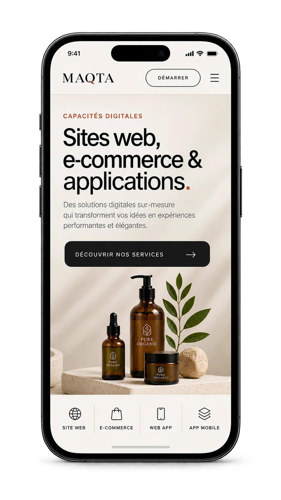
01
Business websites & landing pages
Clear pages built to explain the offer, strengthen credibility and guide visitors toward an enquiry or another defined action.
Business websites, landing pages, e-commerce stores, web apps and mobile applications: we design clear, responsive digital experiences that stay coherent with your brand identity.
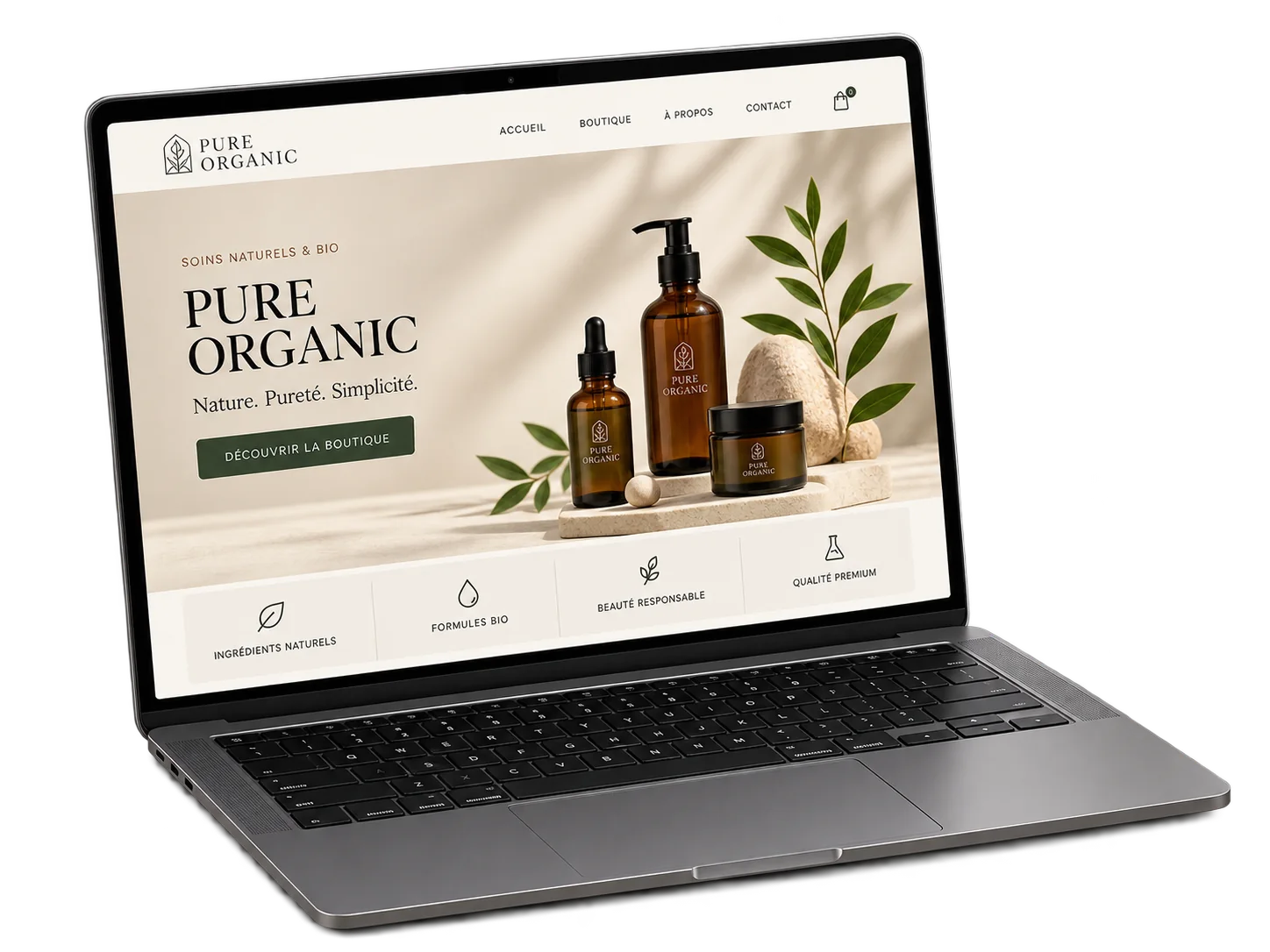
We start with the goal: present a business, generate enquiries, sell online or create a working tool. Architecture, content, interface and functionality are then shaped around that real need.
Each format serves a different purpose. We define the right scope before design or development begins.
Clear pages built to explain the offer, strengthen credibility and guide visitors toward an enquiry or another defined action.
Catalogues, product pages, cart and purchase journeys structured around the brand and ease of use on desktop and mobile.
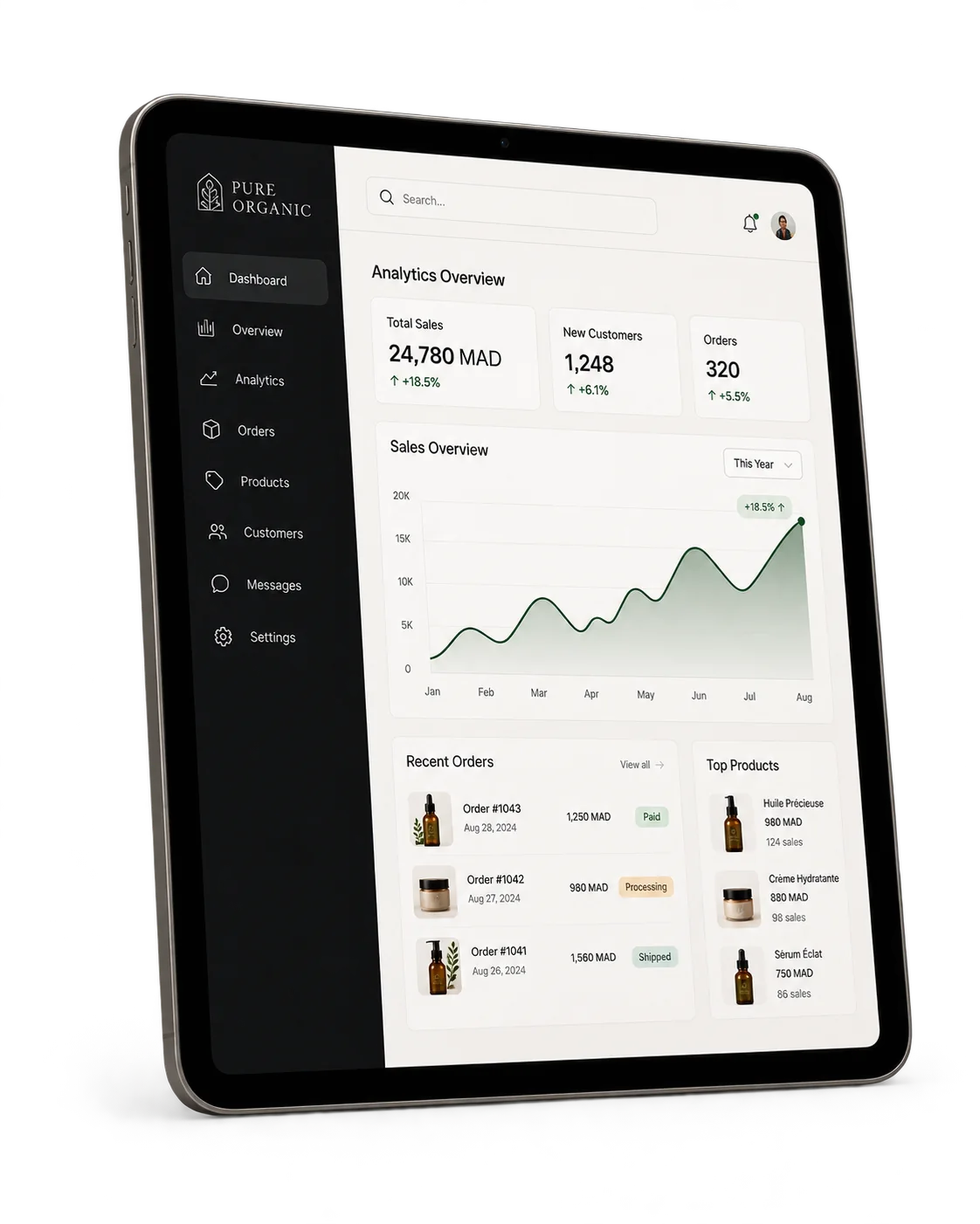
Dashboards, client areas, advanced forms and web tools whose screens and features are defined around the project’s real workflow.
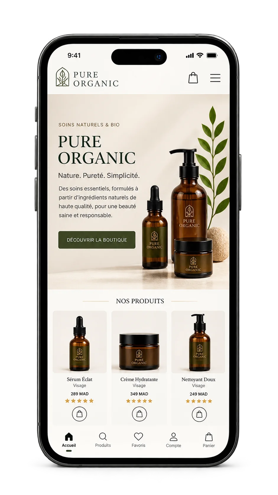
Touch-first interfaces with navigation, content and functionality defined according to the product brief and its priority user journeys.
Good visuals are not enough. The structure also needs to be clear for users, search engines and the devices displaying the experience.
A readable, usable experience across mobile, tablet and desktop.
Headings, content and calls to action organised to make the offer easier to understand.
Semantic HTML, metadata, internal links and descriptive imagery implemented cleanly.
Optimised images, considered loading behaviour and code appropriate to the project scope.
A simple process lets us validate the important decisions before moving to the next stage.